Preview from William Bernstein's
Now Available from McGraw-Hill
NO GUTS, NO GLORY There are certain things that cannot be adequately explained to a virgin either by words or pictures. Nor can any description that I might offer here even approximate what it feels like to lose a real chunk of money that you used to own.
—Fred Schwed from Where Are the Customers' Yachts?
I’m often asked whether the markets behave rationally. My answer is that it all depends on your time horizon. Turn on CNBC at 9:31 A.M. any weekday morning and you’re faced with a lunatic asylum narrated by the Three Stooges. But stand back a bit and things become much calmer and ordered. When the market is viewed over decades, its behavior is as predictable as a Lakers-Clippers game. The one thing that stands out above all else is the relationship between return and risk. Assets with higher returns invariably carry with them stomach-churning risk, and safe assets almost always have lower returns. The best way to illustrate the critical relationship between risk and return is by surveying stock and bond markets over the centuries.
The Fairy Tale
When I was a child in back in the fifties, I treasured my monthly trips to the barber shop. I’d pay my quarter, jump into the huge chair, and for 15 minutes become an honorary member of adult male society. Conversation most often revolved around the emanations from the television set: a small household god dwarfed by its oversized mahogany frame. The fare reflected the innocence of the era: I Love Lucy, game shows, and if we were especially lucky, afternoon baseball. But I do not ever recall hearing one conversation or program that included finance. The stock market, economy, machinations of the Fed, or even government expenditures did not impinge on our barber shop world.
Today, we live in a sea of financial information, particularly pertaining to stocks. On days when the markets are particularly active, our day-to-day routines are saturated with news stories and personal conversations concerning the whys and wherefores of security prices. Even on quiet days, it is impossible to escape the ubiquitous stock ticker scrolling across the bottom of the screen or commercials featuring British royalty discoursing knowledgeably about equity ratios.
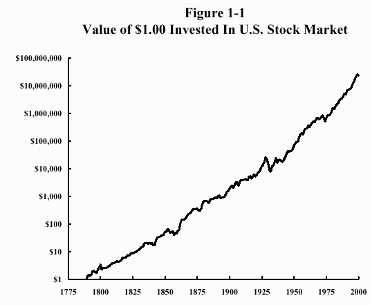
It has become a commonplace that stock returns are the best long-term investment for the average citizen. At one time or another, most of us have seen a plot of capital wealth looking something like Figure 1-1, demonstrating that one dollar invested in the U.S. stock market in 1790 would have grown to over $23 million by 2000.
Unfortunately, no person, family, or organization ever obtained these returns.
There are a whole host of reasons why this is so. First, we invest now so that we may spend later. In fact, this is the essence of investing: the forbearance of immediate spending for future income. Because of the mathematics of return compounding, spending even a tiny fraction on a regular basis devastates final wealth during very long periods: over two centuries, each one percent spent each year reduces the final amount by a factor of eight. For example, a 1% reduction in return would have reduced the final amount to about $3 million, a 2% reduction to about $400,000. Few investors have the forbearance to leave the fruits of their patience untouched. And even if they did, their more feckless heirs would likely make fast work of their fortune.
But even allowing for this, Figure 1-1 is still highly deceptive. For starters, it ignores commissions and taxes, which would have shrunk returns by another percent or two, reducing the final amount to the above $3 million or $400,000. Even more importantly, it ignores "survivorship bias." This term refers to the fact that only the best outcomes make it into the history books; those markets that failed do not. It is no accident that investors focus on the immense wealth generated by the economy and markets of the United States these past two centuries; the champion—our stock market—is the most easily visible, while the losers fade quickly from view.
And yet the global investor in 1790 would have been hard pressed to pick out the United States as a success story. At its birth, our nation was a financial basket case. And its history over the next century hardly inspired confidence, with an unstable banking structure, rampant speculation, and civil war. The nineteenth century culminated in the near bankruptcy of the U.S. Treasury, which was narrowly averted only through the organizational talents of J.P. Morgan. Worse still, for most of the past 200 years, stocks were inaccessible to the average person; before about 1925, it was virtually impossible for even the wealthiest clients to purchase shares in an honest and efficient manner.
Worst of all, the good news about historically high stock returns is now out of the bag. For historical reasons, many financial scholars undertake the serious study of U.S. stock returns with data beginning in 1871. But it’s worth remembering that 1871 was only six years after the end of the Civil War, with industrial stocks selling at ridiculously low prices—just three to four times their annual earnings. Now stocks are selling at nearly ten times that price; for this reason alone it is unlikely that we shall see a repeat of the returns seen in the past 130 years.
Finally, there is the small matter of risk. Figure 1-1 is highly deceptive because of the manner in which the data are displayed, with an enormous range of dollar values compressed into its vertical scale. The Great Depression, during which stocks lost over 80% of their value, is just barely visible; the 1973-1974 bear market, during which stocks lost more than one half of their after-inflation value, is seen only as a slight flattening of the plot. And the October, 1987 Crash is not visible at all. All three of these events drove millions of investors permanently out of the stock market; for a generation after the 1929 Crash, the overwhelming majority of the investing public shunned stocks altogether.
The popular conceit of every bull market is that the public has made the conversion to long-term investing and that they will never sell their stocks because of market fluctuation. And time after time, the investing public loses heart after the inevitable punishing price declines that periodically characterize the capital markets, and the cycle begins anew.
With that in mind, we’ll plumb the history of stock and bond returns around the globe for clues on how to capture some of their rewards.
Ultimately, this book is about the building of investment portfolios that are both prudent and efficient. The construction of a house is a valuable metaphor for this process. The very first thing the wise homebuilder does, before making blueprints, digging a foundation, or ordering appliances, is to learn about the construction materials available to him.
In the case of investing, these materials are stocks and bonds, and it is impossible to spend too much time studying them. We shall expend a lot of energy on the several-hundred-year sweep of human investing—a topic that some will initially find tangential to our ultimate goal. Rest assured that our efforts in this area will be well rewarded. For the better we understand the nature, behavior, and history of our building materials, the stronger our house will be.
The study of financial history is an essential part of every investor’s education. It is not possible to precisely predict the future, but a knowledge of the past often allows one to identify financial risk in the here and now. Returns are uncertain. But risks, at least, can be controlled. We tend to think of the stock and bond markets as relatively recent historical phenomena, but in fact there have been credit markets since human civilization first took root in the fertile crescent. Governments have been issuing bonds for several hundred years. More importantly, after they were issued, these bonds then fluctuated in price according to economic, political, and military conditions just as they do today.
Nowhere is historian George Santayana’s famous dictum, "Those who cannot remember the past are condemned to repeat it," more applicable than in finance. The history of these markets provides us with invaluable wisdom about the nature of the capital markets and of security returns. Intelligent investors ignore this record at their peril.
Risk and Return Over the Centuries
Even before money first appeared in the form of small pellets of silver 5,000 years ago, there have been credit markets. It is likely that for tens of thousands of years of prehistory, loans of grain and cattle were made at interest; a bushel or calf lent in winter would be repaid twice over at harvest time. Such practices are still widespread in primitive societies. (When gold and silver first appeared as money, they were valued according to head of cattle, and not the other way around.) But the invention of money magnified the prime question that has echoed down through investment history: How much return should be paid by the borrowers of capital to its lenders?
You may be wondering by now about why we’re spending time on the early history of the credit markets. The reason for their relevance is simple. Two Nobel Prize winning economists, Franco Modigliani and Merton Miller, realized over four decades ago that the aggregate cost of and return on capital is the same irrespective of whether stocks or bonds are employed. In other words, had the ancients used stock issuance instead of debt to finance their businesses, the rate of return to investors would have been the same. So we are looking at a reasonable portrait of investment return over the millennia.
The history of ancient credit markets is fairly extensive. In fact, much of the earliest historical record from the fertile crescent—Sumeria, Babylon, and Assyria—concerns itself with the loaning of money. Hammurabi’s famous Babylonian Code—the first comprehensive set of laws—dealt with commercial transactions.
A small ancient example will suffice. In Greece, a common business was that of the "bottomry loan," made against a maritime shipment, which was forfeited if the vessel sunk. A fair amount of data is available on such loans, with rates of 22.5% for a round-trip voyage to the Bosphorus in peacetime and 30% in wartime. Since it is likely that less than 10% of ships were lost, these were highly profitable in the aggregate, though quite risky on a case-by-case basis. This is one of the first historical demonstrations of the relationship between risk and return: the 22.5% rate of interest was high, even for that period, reflecting the uncertainty of dealing with maritime navigation and trade in those days. Further, the rate increased during wartime to compensate for the higher risk of cargo loss.
Another thing we learn from a brief tour of ancient finance is that interest rates responded to the stability of the society; in uncertain times returns were higher, because there was less sense of public trust and of societal permanency. All of the major ancient civilizations demonstrated a "U-shaped" pattern of interest rates, with high rates early in their history which slowly fell as their civilization matured and stabilized, reaching a minimum at the height of their development, rising again as they decayed. For example, the apex of the Roman Empire in the first and second century A.D. saw interest rates as low as 4%.
As a general rule, the historical record suggests excellent investment returns in the ancient world. But this record reflects only those societies that survived and prospered, since successful societies are much more likely to leave a record. Babylonian, Greek, and Roman investors did much better than those in the nations they vanquished—the citizens of Judea or Carthage had far bigger worries than their failing financial portfolios.
This is not a trivial issue. At a very early stage in history, we are encountering "survivorship bias"—the fact that only the best results tend to show up in the history books. In this century, for example, investors in the U.S., Canada, Sweden, and Switzerland did handsomely because they went largely untouched by the military and political disasters that befell most of the rest of the planet. Investors in Germany, Japan, Argentina, and India were not so lucky; they obtained far smaller rewards.
Thus, it is highly misleading to rely on the investment performance of history’s most successful nations and empires as indicative of your own future returns. (At first glance, it might appear that the above lists of winners and losers contradicts the relationship between risk and return. This is an excellent example of "hindsight bias"; in 1913, it was by no means obvious that the U.S., Canada, Sweden, and Switzerland would have the highest returns, and that Germany, Japan, Argentina, and India, the lowest. Going back further, in 1750, France and Spain were the mightiest economic and military powers in Europe, with England an impoverished upstart with uncertain prospects.)
The interest rate bottom of 4% reached in Rome is particularly relevant to the modern audience. Not before, and perhaps not since, have the citizens of any nation had the sense of cultural and political permanence experienced in Rome at its apex. So the 4% return at Rome’s height may represent a kind of natural lower limit of investment returns, experienced only by the most confident (or perhaps overconfident) nations at the top of their game.
The Austrian economist Eugen von Böhm Bawerk stated that the cultural and political level of a nation could be discerned by its interest rate: the more advanced the nation, the lower the loan rate. Economist Richard Sylla notes that a plot of interest rates can be thought of as a nation’s "fever chart," with upward spikes almost always representing a military, economic, or political crisis, and long flat stretches signifying extended periods of stability.
As we’ll see, the 4% Roman rate of return is about the same as the aggregate return on capital (stocks and bonds, considered together) in the U.S. in the twentieth century, and perhaps even a bit more than the aggregate return expected in the next century. (The 4% Roman was gold-based, so the return was a real, that is, after-inflation, return.)
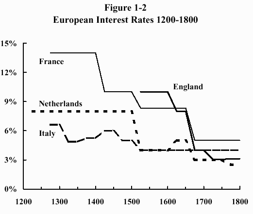
The same phenomenon was observed in Europe. The primitive and unstable societies of medieval Europe initially had very high interest rates, which gradually fell as the Dark Ages gave way to the Renaissance and Enlightenment: in Figure 1-2, I’ve plotted European interest rates from the thirteenth through the eighteenth centuries.
One of the most important European financial inventions was the "annuity," that is, a bond that pays interest forever, without ever repaying the principal amount. This is different from the modern insurance company annuity, in which payments cease with the death of the owner. European annuities were usually issued by a government to pay for war expenses and never expired; instead, they were handed down and traded among succeeding generations of investors. Newcomers tend to recoil at a loan that yields only interest with no return of principal, but the annuity is a very useful way of thinking about the price of a loan or bond. It’s worth spending some time discussing the topic, because it forms one of the foundations of modern finance.
If you have trouble dealing with the concept of a loan which pays interest forever but never repays its principal, consider the modern U.S. 30-year Treasury bond, which pays 60 semiannual coupons before repaying its principal. Over the past 30 years, inflation has averaged over 5%; during that period the purchasing power of the original dollar fell to less than 23 cents. (In other words, the purchasing power of the dollar declined by 77% during this period.) So almost all of the value of the bond is garnered from interest, not principal. Extend the term of the loan to 100 years, and the inflation-adjusted value of the ending principal payment is less than one cent on the dollar.
The historical European government annuity is worthy of modern consideration for one compelling reason: its value is extremely simple to calculate. One simply divides the annual payment by the current (market) interest rate. For example, consider an annuity that pays $100 each year. At a 5% interest rate, this annuity has a value of $2,000 ($100/0.05 = $2,000). If you have purchased an annuity when interest rates were 5%, and the rates then increased to 10%, the value of your annuity has fallen by half, since $100/0.1 = $1,000.
So we see that the value of a long-term bond or loan in the marketplace is inversely related to the interest rate. When rates rise, the price falls; when rates fall, the price rises. (Modern long-duration bonds are priced in nearly the same way: if the bond yield rises proportionally by 1%—say from 5.00% to 5.05%—it has lost 1% of its value.)
The best known early annuity was the Venetian prestiti, used to finance the Republic’s wars. It carried a rate of only 5%. Since prevailing interest rates in the nation’s credit markets were much higher, the purchase of a prestiti at a 5% rate constituted a kind of tax levied on the Republic’s wealthiest citizens, who were forced to buy them at face value. But the Venetian treasury did allow owners to sell their prestiti to others. Prestiti soon became the favored vehicle for investment and speculation among Venetian noblemen and were even widely held throughout Europe.
Consider a prestiti forced upon a wealthy citizen for 1,000 ducats yielding 50 ducats per year, or 5%. If the prevailing interest rate in the secondary market was actually 6.7%, then the owner could sell it in the market at only 75% of its face value, or 750 ducats, since 50/0.067 = 750.)
I’ve plotted the prices of prestiti during the fourteenth and fifteenth centuries in Figure 1-3.
For the first time in the history of capital returns, we are now able to examine the element of risk. Defined in its most basic terns, risk is the possibility of losing money. A fast look at Figure 1-3 shows that prestiti owners were certainly exposed to this unhappy prospect. For example, in the tranquil year of 1375, prices reached a high of 92˝. But just two years later, after a devastating war with Genoa, interest payments were temporarily suspended and vast amounts of new prestiti were levied, driving prices as low as 19; this constituted a temporary loss of principal value of about 80%. Even though Venice’s fortunes soon reversed, this financial catastrophe shook investor confidence for more than a century, and prices did not recover until the debt was refinanced in 1482.
Even taking these stumbles into account, investors in medieval and Renaissance Europe earned healthy returns on their capital. But these rewards were bought by shouldering risk, red in tooth and claw. As we shall soon see, later investors in Europe and America also have experienced similar high inflation-adjusted returns. But even in the modern world, where there is return, there also lurks risk.
The point of this whole historical exercise is to establish the most important concept in finance, that risk and return are inextricably connected. If you desire the opportunity to achieve high returns, you are going to have to shoulder high perceived risks. And if you desire safety, you will of necessity have to content yourself with meager rewards. Consider the prices of prestiti in three different years:
Year
Price
1375
92˝
1381
24
1389
44˝
The Venetian investor who bought prestiti 1375, when the Republic seemed secure, would have been badly damaged. Contrariwise, the investor brave enough to purchase at 1381’s depressed price, when all seemed lost, would have earned high returns. High returns are obtained by buying low and selling high; low returns are obtained by buying high and selling low. If you buy a stock or bond with the intention of selling it in, say, twenty years, you cannot predict what price it will fetch at that future date. But you can state with mathematical certainty that as long as the issuing company does not bankrupt, the lower the price you pay for it now, the higher your future returns will be; the higher the price you pay, the lower your returns will be.
This is an essential point that escapes most small investors. Even the world’s most sophisticated financial economists occasionally make this mistake: in financial academese, they "conflate expected returns with realized returns." Or in plain English, they confuse the future with the past. This point cannot be made forcefully enough or often enough: high previous returns usually presage low future returns, and low past returns usually mean high future returns.
The rub here is that buying when prices are low is always a very scary proposition. The low prices that produce high future returns are not possible without catastrophe and risk. The moral for modern investors is obvious: the recent very high stock returns in the U.S. would not have been possible without the chaos of the nineteenth century and the prolonged fall in prices that occurred in the wake of the Great Depression. Conversely, the placid economic, political, and social environment before the World Trade Center bombing resulted in very high stock prices; the disappearance of this apparent low-risk world produced low returns in its wake.
A Closer Look at Bond Pricing and Returns
So far, we’ve only looked at credit and bond returns through a very wide historical lens. It’s now time to focus on the precise nature of bond and debt risk and its behavior over the ages. Let’s assume that you are a prosperous Venetian merchant, happily sipping bardolino in your palazzo, thinking about the value of the prestiti that your family has had registered at the Loan Office in the Piazza San Marco for the past few generations. From your own experience and that of your parents and grandparents, you know that the prices of these annuities respond to two different factors. The first is that of absolute safety—whether or not the Republic itself will survive. When the barbarians are at the gates, interest rates rise and bond prices fall precipitously. When the danger passes, interest rates fall and bond prices rise. The risk, then, is the possibility that the bond issuer (in this case, the Republic itself) will not survive. In modern times, we worry more about simple bankruptcy than military catastrophe.
But you notice something else: that even in the most tranquil times, when credit becomes easy and interest rates fall, prices rise. When credit becomes tight and interest rates rise, prices fall. This is of course as it should be—the iron rules of annuity pricing mandate that if interest rates double, their value will halve.
You begin to get unnerved at the rises and falls in your family fortunes with the credit market’s gyrations; you ask yourself if it is possible to reduce or even eliminate this risk. The answer, as we’ll shortly see, is a resounding "yes."
But before we proceed, let’s recap. The first risk—that of the Turks overrunning the republic or your neighbor’s ship sinking— is called "credit risk." In other words, the possibility of losing some, or all, of your principal because of the debtor’s failure. The second risk—that caused by the rise and fall of interest rates—is called "interest-rate risk." For the modern investor, interest-rate risk is virtually synonymous with inflation risk. When you buy a 30-year Treasury bond, the biggest risk you are taking is that inflation will render your future interest and principal payment nearly worthless.
The solution to interest-rate risk, then, is to lend short-term. If your loan or bond is due in only one month, then you have virtually eliminated interest rate/inflation risk, since in less than 30 days’ time, you’ll be able to reinvest your principal at the new, higher rate. Ever since the Babylonians began secondary trading of debt instruments, investors have sought safety from interest rate risk in short-term loans/securities. But, as we’ll soon see, short-term loans have their own peculiar risks.
We need to get one last bit of housekeeping out of the way. Henceforth, we shall call short-term obligations (generally less than one year) "bills," and longer-term obligations "bonds." Direct comparisons between bill and bond rates did not become possible until the Bank of England began operations in 1694 and immediately began to dominate the English credit markets.
In 1749, the Chancellor of the Exchequer, Henry Pelham, combined all of the Bank’s long-term obligations. These consolidated obligations later became known as the famous "consols." They were annuities, just like the prestiti, never yielding up their principal. They still trade today, more than two and a half centuries later. These consols, like the prestiti, provide historians with an unbroken record of bond pricing and rates over the centuries.
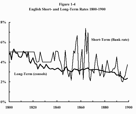
Bills, on the other hand, were simply pieces of paper of a certain face value, purchased at a discount. For example, the Bank of England might offer a bill with a face value of ten pounds. It would be purchased at a discounted price of nine pounds and ten shillings (9˝ pounds) and redeemed one year later at the ten pound face value. This computes out to a 5.26% rate of interest (10/9.5 = 1.0526).
The rates for bills (and bank deposits) and bonds (consols) in nineteenth century England are shown in Figure 1-4. The modern investor would predict that the bills would carry a lower interest than the consols, since the bills were not exposed to interest rate (i.e., inflation) risk. But for most of the century, short-term rates were actually higher than long-term rates. This occurred for two reasons. First, as we’ve already discussed, only in the twentieth century did sustained high inflation become a scourge; gold was money, so investors did not worry about its debasement. And second, wealthy Englishmen valued the consols’ steady income stream. The return on bills was quite variable, and a nobleman desirous of a constant standard of living would find the uncertainty of the bill rate highly inconvenient.
As you can see, the interest rate on short-term bills was much more uncertain than for consols. Thus, the investor in bills demanded a higher return for the their more uncertain payout. Figure 1-4 also shows something far more important: the gradual decrease in interest rates as England’s society stabilized and came to dominate the globe. In 1897 the consol yield hit a low of 2.21%, which has not been seen since. This identifies the high-water mark of the British Empire as well as any political or military event.
The tradeoff between the variability of bill payouts and interest rate risk of consols (and their modern reincarnation of long-term bonds) reverses during the twentieth century. With the abandonment of the gold standard after World War I and the consequent inflationary explosion, the modern investor usually demands a higher return from long-term bonds and annuities than from bills. This is because bonds and annuities risk serious damage from depreciating money (inflation). Thus, in recent years, long-term rates are usually higher than short-term rates, since investors need to be compensated for bearing the risk of inflation-caused damage to long-term bonds.
The history of English interest rates reinforces the notion that with return comes risk. Anarchy and destruction lapped upon Britain’s very shores in between 1789 and 1814. Investing in such a treacherous milieu demanded high returns, and they were forthcoming: a 5.5% perpetual rate (remember, no inflation) with the otherwise ultrasafe consols. On the other hand, the Englishman in the late Victorian era lived in what seemed at the time the height of stability and permanence. With such safety came low returns. History played a cruel trick on the English investor after 1900, with low stock and bond returns being the least of his troubles.
The lesson here for the modern investor is obvious. Before the tragic events of September 11, 2001, many were encouraged by the apparent economic vigor and safety of the post-cold-war world. And, yet, both the logic of the markets and history show us that when the sun shines the brightest, investment returns are the lowest. This is as it should be: stability and prosperity imply high asset prices, which because of the inverse relation between yields and prices, result in low future returns. Conversely, the highest returns are obtained by shouldering prudent risk when things look the bleakest, a theme we shall return to repeatedly.
Bond Returns in the Twentieth Century
The history of bonds in the twentieth century is unique—even the most comprehensive grasp of bond history would not have prepared the nineteenth century investor for the hurricane that buffeted the world’s fixed-income markets after 1900.
In order to understand what happened, it’s necessary to briefly discuss the transition from the gold standard to a paper-currency system that took place in the early 1900s. We’ve already touched on the abandonment of the gold standard after World War I. Before then, except for very brief periods, gold was money; in this country there is still an abundant supply of quarter ($2.50), half ($5), and full ($10) eagles sitting in the hands of collectors and dealers; they are still legal tender. Because of that abundance, most of these coins are not worth much more than their metallic value. However, they disappeared from circulation when their gold value exceeded their face value. For example, a quarter eagle, weighing about an eighth of an ounce, contains about $35 worth of gold at present prices; you’d be foolish to exchange it for goods worth its $2.50 face value.
Over time, the value of gold relative to other goods and services remains roughly constant: an ounce of gold bought a respectable suit of men’s clothes in Dante’s time, and until a just a few years ago, it also did so. Because of the instabilities of international bullion flows resulting from postwar inflation, the gold-standard world, which had existed since the Lydian’s first coinage, disappeared forever in the two decades after the Great War.
Freed from the obligation of having to exchange paper money for the yellow metal, governments began to print bills, sometimes with abandon, as occurred in Germany in the 1920s. The result was the first great worldwide inflation, which accelerated in fits and starts throughout most of the century, finally reaching its climax around 1980, when the world’s central banks and treasuries increased interest rates and finally slowed down the presses.
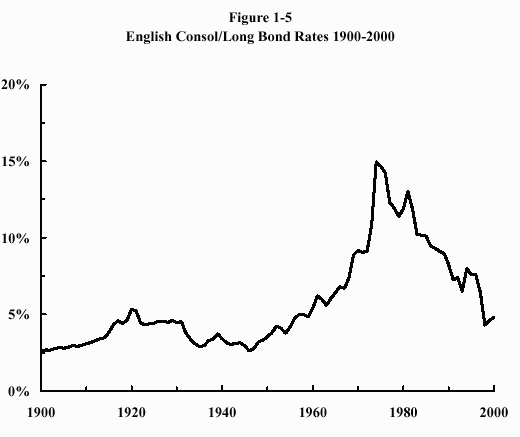
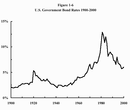
But the damage to investor confidence had already been done. Before the twentieth century, bond buyers had been long accustomed to dollars, pounds, and francs that did not depreciate in value over time. At the beginning of the twentieth century, investors still believed that a current dollar, pound, or franc would buy just as much in fifty years. In the decades following the conversion to paper currency, they slowly realized that their bonds, which promised only future paper currency, were worth less than they thought, producing the rise in interests seen in Figures 1-5 and 1-6, resulting in devastating losses for bondholders.
In short, bondholders in the twentieth century were blindsided by what financial economists call a "thousand year flood": in this case the disappearance of constant-value gold-backed money. Before the twentieth century, nations had temporarily gone off the hard money standard, usually during wartime, but its permanent global abandonment was never contemplated until a decade before it finally occurred after World War I.
The shift in the investment landscape was cataclysmic, and the resulting financial damage done to bonds was of the sort previously seen only as the result of revolution and military disaster. Even in the United States, which suffered no challenge to its government or territory in the 1900s, bond losses were severe.
Consider that in 1925, the U.S. stockholder and bondholder both received a 5% yield. The bondholder could reasonably expect that this 5% yield was a real one—that is, that its fixed value would not decrease over time. The stockholder, on the other hand, balanced the prospect of modest dividend growth versus the much higher risk of stocks. The abandonment of hard money turned all that upside down—suddenly, the future value of the bondholder’s income stream was radically devalued by higher inflation, whereas that of the stockholder was enhanced by the ability of corporations to increase their earnings and dividends with inflation. It took investors more than a generation to realize this, in the process dramatically raising the prices of stocks and lowering that of bonds.
But do not lament today’s paper-based currency, because the gold-based economic system, which Keynes called a "barbarous relic," was far worse. For with hard currency, there is no control of the money supply—the government is committed to exchange bills for gold, or vice versa, at the will of its citizens. So it cannot expand the supply of paper money; otherwise it will risk depleting its gold supply at the hands of individuals who, detecting the increased numbers of dollar bills in circulation, appear at the Treasury’s window bearing dollars. And it cannot shrink the supply of money, lest individuals, detecting the decreased number of bills, appear at the Treasury’s windows bearing gold.
The problem is that national economies are subject to boom-and-bust cycles. These can be mitigated by printing more money during the busts and by taking bills out of circulation during the booms. The advantages of being able to do this under a paper-based monetary system far outweigh the attendant inflationary tendencies of a paper-money system.
Because of the abandonment of hard currency, the history of bonds in the twentieth century was not a happy one. In Figure 1-5, I’ve plotted British government bonds interest rates since 1900. As you can see, this is close to a mirror image of Figure 1-4, with increasing rates for most of the century. What you are looking at is a picture of the financial devastation of British bondholders. Between 1900 and 1974, the average consol yield rose from 2.54% to 14.95%; this corresponds to a price fall of 83%.
But there was even worse news: between those two dates, inflation had decreased the value of the pound by approximately 87%, so the real principal value of the consol had fallen 98% during the period, although that loss was mitigated by the dividends thrown off. The twentieth-century history of bonds in the U.S. is almost as unhappy. Figure 1-6 plots U.S. interest rates since 1900. Once again, inflation gutted returns of U.S. bonds: even after accounting for dividends, the real return of long-term U.S. government bonds in the twentieth century was only 2% per year.
Although it is difficult to predict the future, it is unlikely that we shall soon see a repeat of the poor bond returns of the twentieth century. For starters, our survey of bond returns suggests that prior to the twentieth century they were generous.
Second, it is now possible to eliminate inflation risk with the purchase of inflation-adjusted bonds. The U.S. Treasury version, the 30-year "Treasury Inflation Protected Security," or TIPS, currently yields 3.45%. So no matter how badly inflation rages, the interest payments of these bonds will be 3.45% of the face amount in real purchasing power, and the principal will also be repaid in inflation-adjusted dollars. (These are the equivalent of the gold-backed bonds of the last century.)
Third, inflation is a painful, searing experience for the bondholder and is not soon forgotten. During the German hyperinflation of the 1920s, bonds lost 100% of their value within a few months. German investors said, "Never again," and for the past 80 years, German central banks have carefully controlled inflation by reining in their money supply. American investors, too, were traumatized by the Great Inflation of 1965-1985 and began demanding an "inflation premium" when purchasing long-term bonds. For example, currently, long-term corporate bonds yield over 7%, nearly 5% above the inflation rate.
Lastly, and I’ll admit this is weak reed, it is possible that the world’s central banks have finally learned how to tame the inflationary beast.
But the key point is this: bond returns in the last century should not be used to predict future bond returns. The past few pages have more than adequately described bond risks. The monetary shocks of the twentieth century are among the most severe in recorded economic history, and it is more likely that inflation-adjusted bond returns going forward will be closer to the 3%-4% rate of the previous centuries than to the near zero rate of the last ninety years.
The Long-Term History of Stock Returns
The history of stock returns is much more restricted. Although there has been active trading of stocks in England, France, and Holland for over three centuries, it is only in the past two centuries that we have even partial information on long-term returns of stocks, beginning in the United States soon after the founding of the republic. And only in the past several decades does detailed information become available from around the globe.
At this point, it’s important to discuss the difference between bonds and stocks. A bond is simply a loan. Most often, bonds have a sharply limited upside: the best that you can do is collect your interest payments and principal at maturity. A share of stock, on the other hand, represents a claim on all of the future earnings of the company. As such, its upside is potentially unlimited.
It is of course quite possible to suffer a 100% loss with either; if a company goes bankrupt, both its stocks and bonds may be worth nothing. (Although bondholders have first claim on the assets of a bankrupt company.) The major difference between stocks and bonds occurs during inflation. Because a bond’s payments are fixed, their value suffers during inflationary periods; they may become worthless if inflation is severe enough. Stocks are also damaged by inflation. But since a company can raise the price of the goods and services it produces, its earnings, and thus its value, should rise along with inflation.
This is not to say that stocks are always superior to bonds. Although it is true that stocks often have higher returns because of their unlimited upside potential and inflation protection, there are times when bonds shine.
Stocks, Bonds, and Bills in the Twentieth Century
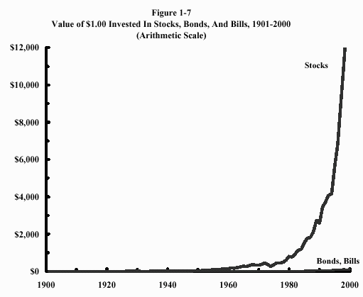
Figure 1-7 summarizes the returns of U.S. stocks, long-term Treasury bonds, and Treasury bills since 1900.
Its message should not surprise you by this point—stocks have the highest returns (9.89% annualized), followed by bonds (4.85% annualized), with "safe" bills (3.86% annualized) bringing up the rear. All of these returns are "nominal," that is, they do not take inflation into account, which during the period averaged 3.6%. So the "real," or inflation-adjusted, returns were about 6% for stocks, 1% for bonds, and zero for bills.
Note that the representation of wealth on the vertical scale of the graph is "arithmetic"—that is, its scale is even, with each tick mark representing the same amount of money (in this case, $100). This graph really doesn’t convey a lot of useful information about stock returns in the first half of the century, and very little about bond or bill returns at all.
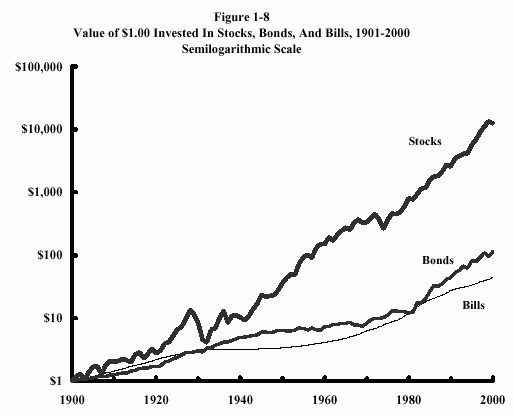
To get around this problem, finance professionals use a slightly different kind of plot to follow wealth creation over very long periods—the so-called "semilog" display shown in Figure 1-8.
This means that the wealth displayed on the vertical axis is represented "logarithmically," that is, each tick represents a tenfold increase in value—from $1 to $10 to $100 to $1,000. This kind of plot is one of the most familiar teaching tools in personal finance, used by brokers and investment advisors across the nation to demonstrate the benefits of stocks to small investors. But, as we have already seen with Figure 1-1, which is also a semilog plot, this kind of graph can be highly deceptive, as it tends to underplay risk.
Risk: The Second Dimension
The study of investment returns is only half of the story. Distilled to its essence, investing is about earning return in exchange for shouldering risk. Return is by far the easiest half, because it is simple to define and calculate, either as "total returns"—the end values in Figures 1-7 and 1-8, or as "annualized returns"—the hypothetical gain you’d have to earn each year to reach that value.
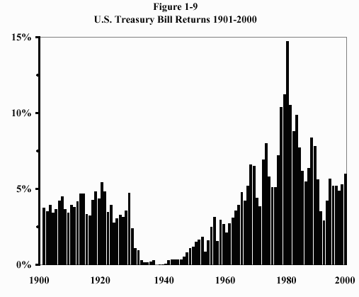
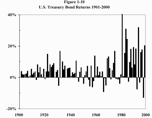
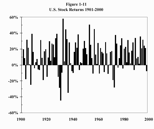
Risk is a much harder thing to define and measure. It comes in two flavors: short-term and long-term. Short-term risk is somewhat easier to deal with. Let’s start with the annual returns of bills, bonds, and stocks, which I’ve plotted in Figures 1-9 through 1-11.
Notice that the bills are "perfectly safe," with nary a losing year. Bonds, on the other hand, do occasionally lose money—as much as 13% in 1999, according to the long-bond data from Professor Jeremy Siegel. And finally, stocks lose money in one of every three years. Sometimes, a lot.
In fact, stocks can behave badly for years at a time. For example, from 1973 to 1974, stocks lost about 40% of their value, while inflation reduced the value of a dollar by nearly 20%, for an after-inflation cumulative loss of about one half. And from the market peak in September 1929 to the bottom in July 1932, the market lost an astonishing 83% of its value. The loss was mitigated, however, by the approximately 20% fall in consumer prices that occurred during the period. The market recovered strongly after 1932, but in 1937 another drop of about 50% occurred.
Figure 1-11 is interesting for another reason. Many investors cling to the belief that by following the right indicator or listening to the right guru, they can reduce risk and increase return by avoiding bear markets. Do you see any particular pattern to the annual returns? If you do, then you’re also likely quite adept at seeing the George Washington Bridge or the face of Bruce Willis in the clouds scudding overhead. The pattern of annual stock returns is almost totally random and unpredictable. The return in the last year, or the past five years, gives you no hint of next year’s return—it is a "random walk." As we’ll see later, no one—not the pundits from the big brokerage firms, not the newsletter writers, not the mutual fund managers, and certainly not your broker—can predict where the market will go tomorrow or next year.
Math Detail
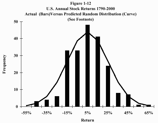
(As explained in the book, feel free to skip any and all math details.—WB)It is relatively easy to measure short-term risk by calculating something statisticians call a "standard deviation" (SD). This can be thought about as the degree of "scatter" of a series of values about the average. For example, the average height of adult males is about 69 inches with an SD of 3 inches. This means that about one sixth of males will be taller than 72 inches and one sixth will be shorter than 66 inches (one SD above or below the mean); about 2% will be taller than 75 inches (2 SD above the mean). For the U.S. stock market, the average annual market return is about 10%, and the SD of market returns is about 20%. So, just like the hypothetical example cited above, a return of zero is one half SD below the mean (that is, the average return of 10% is one half of the 20% SD). In fact the stock market loses money about one third of the time, as predicted by statistical theory. A "worst-case" scenario is a minus two SD result (a loss of 30%), which should occur about 2% of the time. In fact, this is exactly what has occurred-four times in the past 200 years (2% of years) the U.S. market return lost more than 30%. In Figure 1-12, I've plotted the frequency of annual market returns (the vertical bars) versus the "theoretical" probability (the bell-shaped curve) predicted by the laws of statistics. As you can see, the agreement is quite good.
So the twentieth century has seen three severe drops in stock prices, one of them catastrophic. The message to the average investor is brutally clear: expect at least one, and perhaps two, very severe bear markets during your investing career.
Long-term risk—the probability of running out of money over the decades—is an entirely different matter. Strangely, human beings are not as emotionally disturbed by long-term risk as they are by short-term risk. Clearly, long-term returns are much more important than the magnitude of short-term reversals.
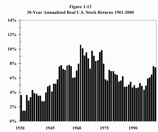
Paradoxically, in the long run, bonds are at least as risky as stocks. This is because stock returns are "mean reverting." That is, a series of bad years is likely to be followed by a series of good ones, repairing some of the damage. Unfortunately, this is a two-edged sword, as a series of very good years is likely to be followed by bad ones, as investors have learned to their chagrin in the past few years. In Figure 1-13, I’ve plotted the annualized 30-year real (inflation-adjusted) returns of stocks. Note how placid this graph looks, with no periods of real, let alone nominal, losses. This sort of plot is often used to demonstrate that stocks become "less risky" over time.
But as we’ve already seen, it’s easy to make graphs lie. Notice that the difference between the lowest and highest return is about 5%. Compound a 5% return difference over 30 years and you wind up with a more than fourfold difference in value. End-period wealth—the total amount of capital you have after 30 years—is a much better gauge of long-term risk than are annualized returns.
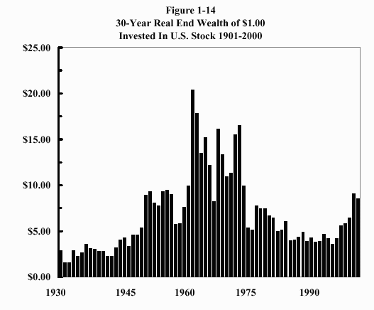
In Figure 1-14, I’ve plotted the real (inflation-adjusted) end wealth for $1.00 invested in each of the 30-year periods in this century. Note the enormous range of values. If these amounts represent your retirement nest egg, it can be easily seen that gap between the best and worst 30-year periods represents the difference between a comfortable old age and the poor house.
Retirement planning is an enormously complicated topic, which we’ll explore in Chapter Twelve in some detail. Obviously, your personal circumstances are critically important here, but one thing is clear: an examination of historical stock returns shows that the market can perform miserably for periods as long as 15-20 years. For example, during the 17 years from 1966 to 1982, stock returns just barely kept up with inflation, with the brutal 1973-1974 bear market occurring in the middle of the period. Had you begun your retirement in 1966, the combination of poor inflation-adjusted returns and mandatory withdrawals would likely have devastated your assets—there would have been little or no savings left to enjoy the high returns that followed.
Bonds, on the other hand, are even worse, since their returns do not mean revert—a series of bad years is likely to be followed by even more bad ones, as happened during the 1970s. This is the point made by Jeremy Siegel in his superb treatise, Stocks For The Long Run. Professor Siegel pointed out that stocks outperformed bonds in only 61% of years after 1802, but that they bested bonds in 80% of ten-year periods and in 100% of 30-year periods.
Looked at from another perspective, in the 30 years from 1952 to 1981, stocks returned 9.9% and bonds returned only 2.3%, while inflation annualized out at 4.3%. Thus, during this period the bond investor lost 2% of real value on an annualized basis, while the stock investor made a 5.6% real annualized return. The last fifteen years of that period were years of high inflation, so this is just another way of saying that stocks withstand inflation better than bonds.
Short-term risk, occurring over periods of less than several years, is what we feel in our guts as we follow the market from day to day, and month to month. It is what gives investors sleepless nights. More importantly, it is what causes investors to bail out of stocks after a bad run, usually at the bottom. And yet, in the long-term, it is of trivial importance. After all, if you can obtain high long-term returns, what does it matter if you have lost and regained 50% or 80% of your principal along the way?
This, of course, is easier said than done. Even the most disciplined of investors exited the markets in the 1930s, never to return. Obsession with the short-term returns ingrained in human nature; the impulse is impossible to ignore. Your short-term investing emotions must be recognized and dealt with on their own terms. It is an easy thing to look at the above data and convince yourself that you will be able to stay the course through the tough times.
But actually doing it is an entirely different affair. Examining historical returns and imagining losing 50% or 80% of your capital is like practicing an airplane crash in a simulator. Trust me, there is a big difference between how you’ll behave in the simulator and how you’ll perform during the real thing. During bull markets, everyone believes that they’re committed to stocks for the long term. Unfortunately, history also tells us that during bear markets, it’s hard even to give stocks away; most investors are simply not capable of withstanding the vicissitudes of an all-stock investment strategy.
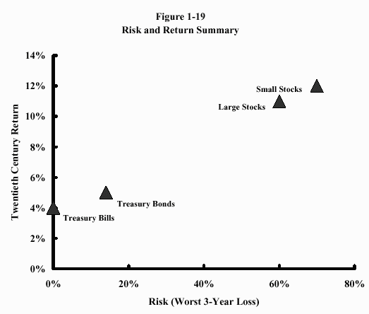
The data for the U.S. markets displayed in Figures 1-9 to 1-14 are summarized in Table 1-1.
Table 1-1. Historical Returns and Risks of U.S. Stocks and Bonds in the 20th Century
Asset
Annualized Return
Worst Real Three-Year Loss
Treasury Bills
4%
0%
Treasury Bonds
5%
-25%
Large Company Stocks
10%
-60%
Small Company Stocks
12%
-70%
It’s pretty clear that there’s a relationship between return and risk—one enjoys high returns only by taking substantial risks. If you want to earn high returns, be prepared to suffer grievous losses from time to time. And if you want perfect safety, resign yourself to low returns. In fact, the best way to spot investment fraud is the promise of safety and very high returns. If someone promises you this, turn 180 degrees and do not walk—run. This is such an important point that I’m going to repeat it:
High investment returns cannot be earned without taking substantial risk. Safe investments produce low returns.
We’ll go into the relationship between risk and return in much more detail later, but it’s worth mentioning one everyday example here. Almost every one of you owns a money market account from one of the large mutual fund companies. The reason you do is that money fund yields are much higher than you get from a bank passbook or checking account. This is because your money market account carries with it a slight amount of risk—it owns "commercial paper" issued by large corporations, which is not insured and can default, whereas your bank accounts are federally-insured. So you are being rewarded for taking this risk with extra return. (It’s also true that the fund industry does its best to soft pedal this inconvenient fact. No major fund company’s money market fund has ever "broken the buck," even though commercial paper does occasionally default. In 1990, paper issued by Mortgage and Realty Trust, held by many large money market accounts, fell into default. Passing these losses onto the shareholders would have resulted in a devastating loss of confidence, and without exception, the fund companies reimbursed their money market funds. One company alone—T. Rowe Price—spent about $40 million repairing the damage. But there is no guarantee that they will always be able to do this. In addition, banks’ yields are hobbled by the necessity of holding unloaned reserves.)
Stock Returns Outside the U.S.
The investment stories and data presented in this chapter vividly display the interplay between investment and societal risk factors and return. High-risk societies—or crisis periods in stable societies—result in high investment returns, if they survive. As we saw with Venetian prestiti, the highest returns of all were made during the transition from a high-risk to a low-risk environment. And, as we’ve already alluded to, the high returns of U.S. stocks were at least partly the result of the same phenomenon, drawn out over two centuries.
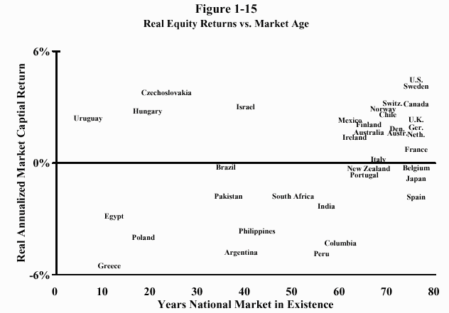
In fact, the U.S. stock returns of the past 200 years represent a best-case scenario. To get a more realistic view of stock returns, it’s critical to examine stock returns from as many nations, and as long a period, as possible. Professors Philippe Jorion and William Goetzmann examined stock returns from around the world in the twentieth century, and the picture they draw is not nearly as pretty as the American story. With their kind permission, I’ve reproduced their summary findings, shown in Figure 1-15.
This graph is a bit confusing, but it’s worth the effort to understand it.
The horizontal (bottom) axis plots the number of years each market has been in existence. Almost all of the nations on the right half of the graph—the ones with the longest market histories—are developed western nations. Because stock markets attend development, it is no surprise that some of the most developed countries were the first to create them. Most of these nations—especially the U.S., Canada, Sweden, Switzerland, Norway, Chile, Denmark, and Britain—have high stock returns. (The returns shown on the vertical axis are a bit misleading to the non-academic reader, as they subtract out the return due to inflation, and further, do not include dividends.)
Now look on the left-hand portion of the graph. These are the markets with the shortest histories, and are exclusively what we would today call "emerging markets." Although there is a fair amount of scatter, note how in general, the countries clustering on the left half of the graph have lower returns than the "developed" nations on the right half of the graph.
Some consider Figure 1-15 to be an argument against investing in emerging markets. It is no such thing. Remember that a century ago, the U.S. was an emerging market, and two centuries ago, England, France, and Holland were too. Rather, it is a demonstration that the markets with the best returns survive, and that those with the worst returns do not—survivorship bias, yet again.
The moral here is that because the most successful societies have the highest stock returns, they become the biggest stock markets and are considered the most "typical." Looking at the winners, we tend to get a distorted view of stock returns. It helps to recall that three centuries ago, Spain had the world’s largest economy and that a century ago, that distinction belonged to England.
Yet even the detailed work cited above provides a skewed version of national security returns. You’ll note that many of the names at the top of the graph are of English-speaking nations that were largely spared the destruction of the two world wars. As grievously as Britain and its Commonwealth suffered in these conflicts, she did not suffer the near-total destruction of her industrial apparatus, as did Germany, the rest of continental Europe, Russia, Japan, and China. Limiting our analysis to the postwar period after the initial phase of postwar reconstruction may provide a much less biased estimate of non-U.S. investment returns.
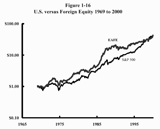
The Morgan Stanley Capital Index Europe, Australasia, and Far East (EAFE) Index is a highly accurate measure of equity returns in the developed world outside the U.S. In Figure 1-16, I’ve plotted the values of a dollar invested in the S&P 500 Index and the EAFE since its inception in 1969. The returns were virtually the same: annualized returns of 11.89% for the EAFE versus 12.17% for the S&P 500, with end wealths of $39.43 and $36.44, respectively.
In a world in which billions of dollars of capital can be instantaneously moved around the globe with a keystroke, this is as it should be, of course. There is no reason why an investor from one nation should accept as a matter of course poor returns in their own country if they can just as easily invest abroad. If investors think that returns will be higher in Australia than in Belgium, then capital will flow from Belgium to Australia. This will depress prices in Belgium, which in turn will increase future returns. The opposite will occur in Australia. Prices will adjust to the point where the expected returns in both nations will be the same. Assuming that the risks are the same, there is no reason that the future return in any one nation should be higher than another. And to the extent that one nation is perceived to be riskier than another, the nation with the highest perceived risk should have the highest future return, in order to compensate for the extra risk.
Since World War II, real long-term stock returns in the U.S. have been about 8% (after dividends and inflation are taken into account), dwarfing bond performance. But world financial history cautions us not to expect the generous rewards of U.S. stocks in the future. In fact, historical returns are of only limited use in predicting future returns. The real value of the historical record is as a gauge of risk, not return.
Size Matters
As we move forward through the twentieth century, a wealth of detail about stock returns comes into increasingly sharp focus. In recent decades, financial economists have begun to study how company characteristics affect stock return.
The first company characteristic to be studied was size. The "size" of a company can be measured many ways— the number of its employees, or the amount of sales, profits, or physical assets it owns. But the most easily measured and most important number to investors is its "market capitalization" (usually shortened to "market cap"), which is the total market value of its outstanding stock. This is an important number for many reasons, not the least of which is that most market indexes are market cap weighted, meaning that the representation of each stock in the index is proportional to its market cap. For example, as of this writing the biggest company in the S&P 500 is General Electric, with a market cap of $460 billion. The smallest is American Greetings, with a market cap of $700 million. Thus, the S&P contains 600 times as much GE as it does American Greetings.
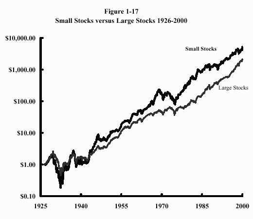
Is there a difference between the returns of small and large companies? Yes. It appears that small stocks have had higher returns than large ones. In Figure 1-17, I’ve plotted the returns of the stocks of the largest and smallest companies in the U.S. market from July 1926 to June 2000.
This data was kindly supplied by Professor Kenneth French of MIT. He divided the markets into three groups—small, medium, and large. (I’ve omitted the medium-sized stocks in this graph.) I’ve summarized the data below:
Small versus Large Stocks, July 1926-June 2000
End Wealth
Ann'd Return
9/29-6/32
12/72-9/74
Small Stocks
$5,522
12.35%
-90.78%
-53.15%
Large Stocks
$2,128
10.91%
-84.44%
-43.47%
Note how small stocks have had higher returns than larger stocks, but also have higher risks. In both the Great Depression and the 1970s bear market, small stocks sustained higher losses than large stocks. In addition, the small stock advantage is extremely tenuous—it’s less than a percent and a half per year, and there have been periods of more than thirty years when large stocks have bested small stocks. For these reasons, the small stock advantage is controversial. But over long time periods, it is present in most foreign countries. For example, over the past 46 years British small stocks have outperformed large stocks by 2.66% per year, and over the past 31 years the small stock advantage in Japan has been 1.78%. As in the U.S., in both cases, small stocks were riskier. Once again, the relationship between risk and return holds up. Yes, you can have higher returns. But only by bearing more risk.
Company Quality and Stock Return
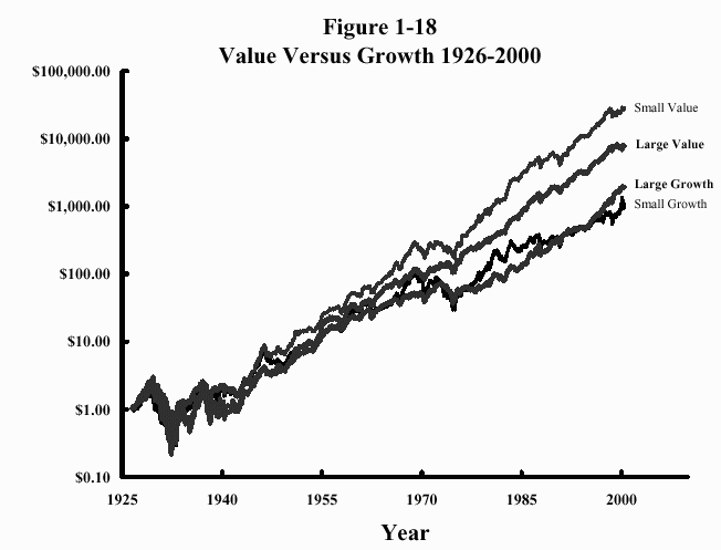
Finally, there is the issue of corporate quality. Simply put, there are "good" companies, and there are "bad" companies. And it’s critical that you grasp how the market treats them and how this in turn affects the risk and return of your portfolio.
First, I’d like to introduce a bit of investment nomenclature. In common parlance, the shares of good companies are called "growth stocks," and those of bad companies are called "value stocks." Let’s consider, for a moment, Wal-Mart and Kmart. The former is financially healthy and universally admired, with legendary management, a steadily growing stream of earnings, and a huge pile of cash on hand for emergencies. The latter has just entered Chapter 11 and is a sick puppy, with marginal financial resources, a history of poor management, and very irregular earnings. Wal-Mart is manifestly a good/growth company. Kmart is a bad/value company; without making too fine a point, it is in fact a real dog.
More importantly, Wal-Mart, aside from being the better company, is also the safer company. Because of it’s steadily growing earnings and assets, even the hardest of economic times would not put it out of business. On the other hand, Kmart’s finances are marginal even in the best of times; a bad economy could to put it on the wrong side of the daisies with breathtaking speed.
Now we arrive at one of the most counterintuitive points in all of finance. It is so counterintuitive, in fact, that even many professional investors have trouble understanding it. To wit: Since Kmart is a much riskier company than Wal-Mart, investors expect a higher return from Kmart than they do from Wal-Mart. Think about it. If Kmart had the same expected return as Wal-Mart, no one would buy it! So its price falls to the point where its expected return exceeds Wal-Mart’s by a wide enough margin so that investors finally are induced to buy its shares. The key word here is expected, as opposed to guaranteed. Kmart has a higher expected return than Wal-Mart. But this because there is great risk that this may not happen. The proper way to look at a stock like Kmart is as follows: There is a high likelihood, say 75%, that it will not emerge from Chapter 11, and that its stock will become worthless. If, on the other hand, it recovers its earnings capacity, its price will rise greatly—say by a factor of eight. So Kmart's expected return is (75% x 0) plus (25% x 8) minus one, or a 100% gain. In other words, its stock has acquired the characteristics of a lottery ticket.
Thus, the logic of the market predicts that:
Good companies are generally bad stocks;
bad companies are generally good stocks.Is this actually true? Resoundingly, yes. There have been a large number of studies of the growth-versus-value question in many nations over long periods of time. They all show the same thing: unglamorous unsafe value stocks with poor earnings have higher returns than glamorous growth stocks with good earnings. Probably the most exhaustive work in this area has been done by Eugene Fama (University of Chicago) and Kenneth French (MIT), in which they examined the behavior of growth and value stocks. They looked at value versus growth for both small and large companies; value stocks clearly had higher returns than growth stocks. Figure 1-18 and the data below summarize their work:
Annualized Return
1926-2000Large Value Stocks:
12.87%
Large Growth Stocks:
10.77%
Small Value Stocks:
14.87%
Small Growth Stocks:
9.92%
Fama and French’s work on the value effect has had a profound effect on the investment community. Like all ground-breaking work, it prompted a great deal of criticism. The most consistent point of contention was that the results of their original study, which covered the period from 1963 to 1990, was a peculiarity of the U.S. market for those years and not a more general phenomenon. Their response to such criticism became their trademark. Rather than engage in lengthy debates on the topic, they extended their study period back to 1926, producing the data you see above.
Next, they looked abroad. In Table 1-2, I’ve summarized their international data, which covers the years from 1975 to 1996.
Table 1-2. Value versus Growth Abroad, 1975-96
Country
Value Stocks
Growth Stocks
Value Advantage
Japan
14.55%
7.55%
7.00%
U. K.
17.87%
13.25%
4.62%
France
17.10%
9.46%
7.64%
Germany
12.77%
10.01%
2.76%
Italy
5.45%
11.44%
-5.99%
Netherlands
15.77%
13.47%
2.30%
Belgium
14.90%
10.51%
4.39%
Switzerland
13.84%
10.34%
3.50%
Sweden
20.61%
12.59%
8.02%
Australia
17.62%
5.30%
12.32%
Hong Kong
26.51%
19.35%
7.16%
Singapore
21.63%
11.96%
9.67%
Average
16.55%
11.27%
5.28%
Note that in all but one of the countries, value stocks did in fact have higher returns than growth stocks, by an average of more than 5% per year. The same was also true for the emerging market countries studied, although the data is a bit less clean because of the shorter time period studied (1987-1995): in 12 of the 16 nations, value stocks had higher returns than growth stocks, by an average margin of 10% per year.
Campbell Harvey of Duke University has recently extended this work to the level of entire nations. Just as there are good and bad companies, so are there also good and bad nations. And, just as you’d expect, returns are higher in the bad nations—the ones with the shakiest financial systems—because there the risk is highest. By this point, I hope you’re moving your lips to this familiar mantra: because risk is high, prices are low. And because prices are low, future returns are high.
So the shares of poorly-run, unglamorous companies must, and do, have higher returns than those of the most glamorous, best-run companies. Part of this has to do with the risks associated with owning them. But there are also compelling behavioral reasons why value stocks have higher returns, which we’ll go into in more detail in later chapters on asset valuation and behavioral finance: people just cannot look these stocks in the eye. Human beings are profoundly social creatures. Just as people want to own the most popular fashions, so too do they want to own the latest stocks. Owning a portfolio of value stocks is the equivalent of wearing a Nehru jacket over a pair of bell-bottom trousers.
The data on the performance of value and growth stocks runs counter to the way most people invest. The average investor equates great companies producing great products with great stocks. And there is no doubt that some great companies, like Wal-Mart, Microsoft, and GE, produce high returns for long periods of time. But these are the winning lottery tickets in the growth-stock sweepstakes. For every growth stock with high returns, there are a dozen that within a very brief time disappointed the market with lower-than-expected earnings growth and were consequently taken out and shot.
Summing Up: The Historical Record On Risk/Return
I’ve previously summarized the returns and risks of the major U.S. stock and bond classes over the twentieth century in Table 1-1. In Figure 1-19, I’ve plotted these data.
Figure 1-19 shows a clear-cut relationship between risk and return. Some may object to the magnitude of the risks I’ve selected for stocks. But as the recent performance in emerging markets and tech investing show, losses in excess of 50% are not unheard of. If you are not prepared to accept risk in pursuit of high returns, you are doomed to fail.
CHAPTER SUMMARY
1. The history of the stock and bond markets shows that risk and reward are inextricably intertwined. Do not expect high returns without high risk. Do not expect safety without correspondingly low returns. Further, when the political and economic outlook is the brightest, returns are the lowest. It is when things look the darkest that returns are the highest.
2. The longer a risky asset is held, the less the chance of a loss.
3. Be especially wary of data demonstrating the superior long-term performance of U.S. stocks. For most of its history, the U.S. was a very risky place to invest, and its high investment returns reflect that. Now that the U.S. seems to be more of a "sure thing," prices have risen, and future investment returns will of necessity be lower.